
END. Clothing
END. Launches
User research showed key details about hyped launches weren't prominent enough. The redesign put launch dates front and centre and blended product imagery into a new card layout, then spread imagery down the product page to keep people engaged until they entered the draw.
- Client
- END. Clothing
- Role
- Lead Frontend Developer
- When
- 2020 – 2021
- Stack
- Next.js, React, TypeScript, UX research
The problem
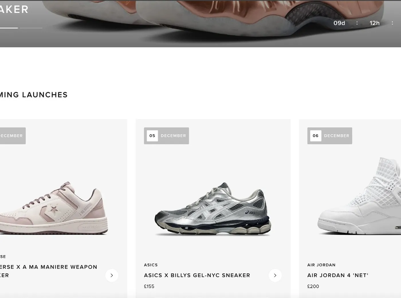
END. Launches is where END. Clothing releases its most hyped products, such as limited sneakers, through a draw that customers enter for the chance to buy. User research showed that the most important information about each launch, especially when it was happening, wasn’t prominent enough. The product imagery also didn’t sit well with the rest of the site.
The launches homepage
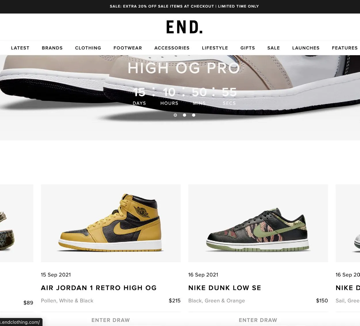
We made the launch date the first thing you see on each product, and blended the product imagery into a new card layout for every launch on the page. The page was built in React, Next.js, Styled Components and TypeScript.
The product page
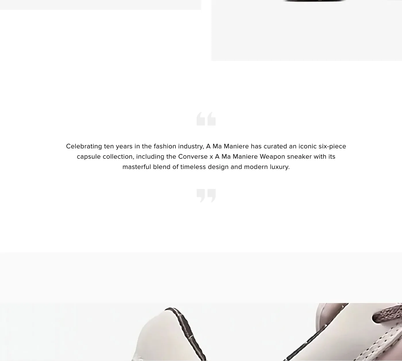
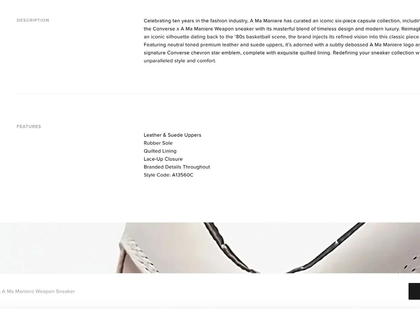
Once someone was interested in a launch, user insights showed they generally scrolled the whole page. So instead of keeping the product imagery in one block at the top, we used the whole page, spreading imagery and product information all the way down.
The result
Spreading the imagery and information out prompted people to stay on the page for longer and go on to submit an entry for the product.